Responsive Web Design (RWD) is evolving and every day we learn a better way that we can implement to improve our responsive sites. RWD has no doubt solved a problem of building up multitude of websites for host of devices available to the customers, ranging from large desktop monitors to small mobile screens. However, do all the websites' layouts appear similar across the multiple devices, especially those that are rich in content?
The fact is that even after responsive design, many websites offer terrible online experiences for the users. Truncated content, slow load times and bizarre side scrolling are all too common in the world of mobile web. It poses a difficult design challenge to adopt content-heavy website in a mobile device. The concern is how to squeeze all your valuable content into such a small screen? Designers have to think, how they can display the information in a small screen that will be easy to navigate and read.
Mobile usage is growing at a rapid pace and those designers, who are getting away from creating a mobile ready site, cannot ignore it anymore. It is a tricky affair to design a responsive website that delivers content both to the desktop and mobile. Most of the time designers suggest separate sites for the mobiles and desktops. The mobile websites are often a simpler version of the desktop sites that are built using minimal colors, simple navigation and minimal content. But, if you want to have the same site working for both your desktop and mobile what will you do then? When you are considering a website which will work both in desktops and mobile devices optimize it appropriately.
Content for your mobile devices
Content that is easier to view on the large screens when become responsive will not appear perfectly on the mobile devices. The existing website contents if squeezed and tried to fit in a mobile window will appear too small and cannot be read. To view such contents, the users have to expand the page beyond the frame or slide page sidewise continuously for reading. You can imagine how frustrating it will be for the users. For obvious reason, they flip to other websites quickly. Since there is a big difference how designs and content look on different screen sizes, it is essential that a site changes its layout to accommodate viewers with smaller screen sizes.
Here are some functions that will make the contents of your page mobile responsive:
Different HTML
For your mobile version consider using dynamic serving instead of taking just a responsive design approach. While there will be a single URL for simplicity, you can serve different HTML based on user agent.
Keep the texts simple and short
The designers have to keep that few square inches of mobile screens in mind when considering the content of the websites. For the users it is very difficult to read the long text from such a small screen. They will lose patience if they have to navigate and scroll several times.
The punchy content offers readers essential information and there is no need to scroll too long for that.
Sticky navigation to improve browsing speed
An online user traditionally has to scroll to the top of the page for accessing the navigation menu. With sticky menus remaining at any part of the page, you are viewing, browsing a site becomes much faster. The users really appreciate the presence of sticky navigation in a website as they can find what they are looking for much faster.
Using Images
With the words going around that the brains can transcend visuals much faster than the texts; there is a tendency to introduce fascinating images within the text. This looks great if the site is opened from the computer. However, visuals make a site heavy and it may take too long time to load in a mobile.
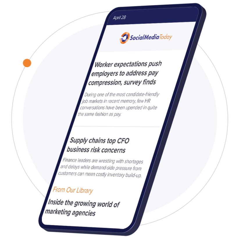
Headlines are better than snippet of your stories
Though the viewers will ultimately end up reading the stories, using primary navigation on the home screen enables them to easily navigate. Mobile website of CNN represents the headlines and the users have to click on the story they want to explore.
Progressive disclosure
The mobile screens are small and the readers can experience information overload when there are too many details displayed in that screen size. Implement a design technique that will reduce clutter and not let the users lose their focus. With progressive disclosure you can reveal only the essential details, hiding the less used elements which the users can access swiping, tapping and scrolling. You need to highlight the actions that are available to the users.
Despite your efforts to optimize the mobile website in the most efficient way, some users may find the navigation and browsing a cumbersome experience. You can maximize the customer satisfaction via new mobile app. Through your mobile app you can offer discounts, rewards and other incentives to lure the customers.
You may have implemented all these ideas, how you can tell how your mobile content marketing efforts really making an impact? A few analytics tool like the Google analytics and Flurry can help you to track your success.


