There's so much content crossing my feeds these days, I would welcome anything that might save me time while helping me grasp complex quantitative information. I wish more organizations would adopt infographics as a way to provide that ability to comprehend what data means in a glance.
What's that you say? We're swimming in oceans of infographics?
Not so, and the fact that just about everyone calls them infographics doesn't make it so.
An infographic is (to borrow the book title from infographic master Edward Tufte) the visual display of quantitative information. On the very first page of the very first chapter of that classic coffee-table book, Tufte lists the criteria for graphical data displays. They should, he writes...
- Show the data
- induce the viewer to think about the substance rather than the methodology, graphic design, the technology of graphic production, or something else
- Avoid distorting what the data have to say
- Present many numbers in a small space
- Make large data sets coherent
- Encourage the eye to compare different pieces of data
- Reveal the data at several levels of detail, from a broad overview to the fine structure
- Serve a reasonably clear purpose: description, exploration, tabulation, or decoration
- Be closely integrated with the statistical and verbal descriptions of a data set
Most of the art that passes for infographics these days do virtually none of these things. Tufte argues that "graphics reveal data." The endlessly scrolling towers of numerals slapped on top of images we see everywhere do nothing of the kind. In fact, most of them are the polar opposite of what an infographic should be.
In a post to her blog, visual design consultant Connie Malamed labels these eyesores as infoposters, "a graphic that conveys multiple segments of information typically using words and numbers to represent quantitative data."
PR counselor Doug Haslam has been poulating a pinboard on Pinterest he calls Infographic Crimes Against Humanity. By way of example, here's one on social media training for employees. Love it or hate it (and I'm with Doug on this one), it's an infoposter. Despite the headline on Ragan's HealthCare News, it doesn't come close to being an infographic:
I would display the entire monstrosity, but it would take up more space than this entire post.
For comparison's sake, take a look at this 1861 infographic from Charles Joseph Minard, which visually conveys the staggering number of soldiers Napolean lost during his Russian campaign. Tufte calls it "probably the best statistical graphic ever drawn."
Tufte explains, "Beginning at the Polish-Russian border, the thick band shows the size of the army at each position. The path of Napoleon's retreat from Moscow in the bitterly cold winter is depicted by the dark lower band, which is tied to temperature and time scales." (Tufte offers a gorgeous frame-ready poster of this infographic for sale.)
Without question, it's quicker and easier to throw text and the occasional bar or pie chart on a tower graphic and call it a day. I find, however, that it takes just as much time to scroll through these tedious graphics and try to make sense of mish-mash of images, numbers and narrative text as it would to read an article.
With all the data we're producing, surely organizations can take the time to craft meaningful infographics that do what they're supposed to: efficiently communicate complex quantitative ideas.
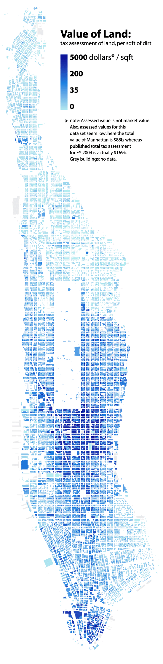
There are examples, but they represent a drop in the ocean of the infoposters polluting the web these days. This one shows the cost of land per square foot in Manhattan (found on another of Haslam's pinboards, Infographics I like.
If you want to stand out from the flood of infoposter mediocrity, make up your mind to produce true infographics. They take more time and effort, but the payoff will be huge.


