Why is logo design so important? Because it might become the single most recognizable part of your company. Case in point? The "Golden Arches."
If all goes well, your logo will become the single most recognizable part of your company.
Take two of the world's top brands for example... would you ever see McDonald's "Golden Arches" or Nike's "swoosh" and not know the company behind them?
And whether or not your business ever sees that kind of success, your logo is going to be an integral part of your business' identity, as it will be seen everywhere from your business cards to possibly even your company vehicle.
If you're ready for some no-bullshit logo design tips that'll result in a logo you'll love (and your target market will too), you'll find everything you need to know below, and more!
Determining the Type of Logo You Want
Generally, there are three types of logos: typographic, illustrative, and abstract graphic/graphic.
Typographic means text-only, (think Prada), illustrative is a logo that demonstrates via a graphic what your business does or sells (think Red Lobster), and a graphic logo (think Target's "bullseye") is a design that was chosen to represent your company, which can often be a symbol that was created uniquely just for your brand (think Nike's "swoosh").
Of course, you are not relegated to stay within the above categories, as many brands combine or alter them as they see fit. (Think Adidas, which is both typographic and abstract graphic or NBC which is both typographic and graphic.)
A Few Questions to Ask Yourself
As you begin the process of not only learning how to choose a logo, but how to choose one that will best represent your company and be able to grow with you, you'll want to be able to answer these questions:
- Who is my target market?
- Who are my main competitors?
- What differentiates me from my competitors?
- What emotions/feelings do I want my logo to evoke?
- What is my tagline and how can I make my logo work with it?
If you already have a logo, but want a redesign, this is one of the best logo design tips I can give you: Think carefully about the above questions, but also take some time to figure out exactly what it is you don't like about your current logo to avoid a repeat situation. Your input is going to be critical, so look at your logo from all angles: color, orientation, type, etc.
Find Inspiration in Everything
 When it comes to deciding the type of logo design you want, there are two key elements you should research: who your top competitors are (and what their logos are) and any artistic elements you personally find appealing that you could incorporate into your new logo's design.
Mali Hirsch, a user experience designer at Scott's Marketplace, believes that taking the time to know what you like is going to be essential to choosing a logo you will love.
She says: "I guess when it comes down to what inspires me as a designer, I will go back to one of the greatest minds of our times - Steve Jobs. In an interview a long time ago he quoted Picasso and said that good artists copy but great artists steal.
"In my opinion, what he meant was that when you want to create something truly remarkable you should look around at great things that people have done throughout time and across many different areas: music, paint, architecture, and so on.
"Then, understand what their inspiration and motivation was. Once you understand that - you should go and make it your own, in your own way.
"To apply this to logo design," Mali continues, "you should look at some of the elements out there and try to understand why something is considered remarkable, 'steal' the concept behind it and bring it into what you're doing.
"It could be a 'flat' look, a typeface, a symbol, or just simply a great color. The key here is not to copy other work but to apply the core of what made it work," she advises.
Colors: What They Mean and Other Essentials
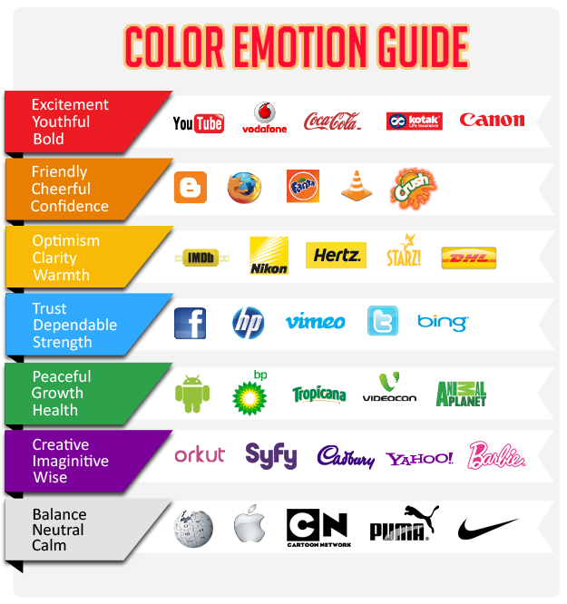 Green may be your favorite color but that doesn't mean it needs to be on your logo. Since colors can elicit an emotional response from your target audience, as well as convey your brand's message, it's very important that your color selection goes deeper than personal preference.
Take a look at what some of the more commonly used colors can signify:
- Blue: Trust, dependability, and strength.
- Red: Action and energy; can elicit a passionate response, but also aggression.
- Yellow: Optimism, positivity, motivation, warmth.
- Green: Nature and serenity. Can imply good health. Lighter greens = more peaceful. Deeper greens signify wealth or prestige.
- Purple: Creativity, mysterious, sophisticated.
- Orange: Energy, friendliness, confidence.
- Pink: Femininity, excitement, romance, and youthfulness. Light pink has sentimental tones, hot pink has high energy.
- Brown: Dependability, simplicity. Associated with nature, strength.
It's advised to stick to no more than three colors in your logo and to always look at it in one, two, and three-color options. If you're wondering how you might stack up to the world's top brands when it comes to logo type and color usage, check out these stats below:
- 33% use blue
- 29% use red
- 28% use black or gray scale
- 13% use yellow or gold
- 95% use only one or two colors
- 41% use text only
- 9% don't feature the company name at all
- 5% use more than two colors
Why Hiring a Designer Trumps Your Remedial Art Skills
 Why wouldn't I create my own logo? Because this is what my drawings look like. Know your limits.
Normally I will always try to give you ideas on ways you can save money on various business costs, but there are some areas that I just can't advise skimping in - and your logo is one of them.
That's why, if you were seriously considering trying to create your own logo, I think you should stop right there. I mean, I love to draw, but I know my strange rabbit/dog hybrids don't belong anywhere near a logo.
So keep your remedial art skills to yourself and wisely delegate logo design to a professional.
That being said, if you can find an independent designer, rather than going to a local design firm, you'll probably be able to save a little cash that way.
If You Want a Great Logo, Get Out of Your Designer's Way
You might like lens flares more than J.J. Abrams, but a good designer will not only know they don't belong on a logo - they'll tell you that when you insist you want them.
Yes, it's important that you convey the feeling, emotion, message, look, etc., that you are hoping to achieve with your logo, but it's also important that you let an expert showcase his or her expertise.
Trust is very important when it comes to who you select, so make sure you see samples of the designer's work before hiring them... and then let them do their job while you get back to yours.
Marcus Shields, senior manager of user experience and product design at Scott's Marketplace, agrees. He says, "If you have reviewed the designer's portfolio and selected the designer based on his/her past work, then trust the designer. After all, you're paying for it."
But, Marcus warns, if you want to go the cheapest route, and want to find someone who won't push back when you suggest crappy changes, then don't cry about it when you get crap in return.
He explains: "If you really want a pixel pusher, (a person who has no creative say) you can get one very cheap at the local university or high school, for maybe 1/10th of the cost. This designer will basically be an extension of your arm.
"If you tell him to blend nine poorly contrasting colors, he will. If you tell him to use four fonts, he will. You want lens flares? Put on some shades, he's gonna give you more lens flares than J.J. Abrams.
"Your logo will be bad, and you will blame him. But remember, you get what you pay for so you might want to own up to that blame," suggests Marcus.
"Make It Pop" and Other Things You Should Never Say
You want your logo to "pop" and "fizz"? What the hell does that even mean? Ditch the useless buzzwords and get specific with your feedback.
Communicating with your designer is crucial, but some of the things you might be tempted to say aren't going to get you anywhere at all.
"Lose the buzzwords: Don't tell a designer to make it 'pop,' 'fizz,' 'bubble,' or have any other champagne attribute. Don't tell a designer to 'jazz it up,' 'make it snap,' 'make it lively,' or 'push it to the edge.' All of these expressions are useless," Marcus states.
Instead, be specific and focused with your feedback, he advises, to ensure your designer understands what you're looking for: "If you want a serif logo-type, say that. If you want bold sans-serif type, say that. If you want squares, octagons, ellipses, diamonds, dodecahedrons, etc. then say that. If you want to experiment with negative space, foreshortening, skewing etc. say that. And if you don't know what most of those terms mean, then learn.
"You are paying for this logo, so think of learning these concepts as an investment in yourself. It will help you communicate better with designers for the rest of your career," Marcus says.
Important Dos and Don'ts of Logo Design
 One giant "don't"? Getting funky with a variety of fonts.
If done right, you'll have this logo for many years to come. That's why I had Marcus put together a delightful medley of 'dos' and 'don'ts' below to help you select a logo that'll have long-lasting power.
- Do use bold lines and simple shapes. The logo has to be legible and distinguishable at small sizes.
- Do remember the use of negative space, it can have a big impact on an otherwise mundane logo. It can really help you get an idea across in a very clever way.
- Do keep multiple versions of your logo on hand at all times. At least one multicolor, monotone (one color), and a black-and-white version. There will be situations like printing your logo on shirts, embroidery, and coffee mugs etc. where logos with lots of "effects" may not be permissible. As a business owner, you don't want to miss out on these opportunities because your logo isn't in the right format.
- Don't use swooshes and sunbursts, these are common nonsense elements that many logos use as ornamentation. These make your logo look like a generic entry in a sea of other poorly conceived logos.
- Don't purchase a logo from a pre-made logo website, hundreds if not thousands of people will have your logo. If you do find a rare one, be prepared to pay for exclusive rights. These can be between 2 and 5 thousand dollars.
- Do think about orientation. Say your logo is displayed horizontally but you want it printed on a flyer for an event you are sponsoring... If the other sponsor's logos are vertical or square, the designer may arrange them horizontally. This will cause your logo to be printed slightly smaller than everyone else's. Talk to your designer about getting your logo in multiple orientations to avoid this problem.
- Do make sure your logo is scalable, easy to reproduce, and multifunctional.
- Don't go with anything trendy. As far as logo design tips go, this one is important: It'll be out of style before your target audience even sees it.
- Do ask your designer to also create a favicon of your logo for your website. (The little icon associated with a URL that is variously displayed. E.g., a browser's address bar or next to the site name in a bookmark list.)
Well, there you have it! No-bullshit advice for choosing a logo you'll love. I hope these logo design tips help you not only understand what it is you're looking for in a logo, but how to communicate that information to a designer. (Which can often be one of the hardest parts of the entire process.) If you have any additional questions that weren't answered here, feel free to leave them in comments!