LinkedIn is trying out a new navigation experience, with streamlined function listings designed to simplify in-app navigation on both desktop and mobile versions.
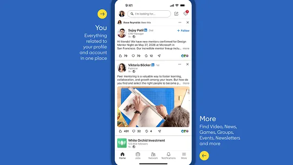
First, in the mobile app, LinkedIn has launched an updated layout that aims to better group its various functions and options.
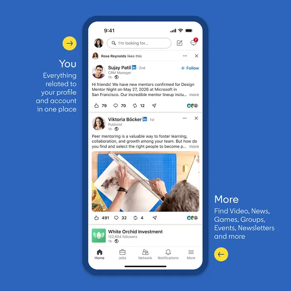
The updated layout essentially declutters the UI, and gathers more related elements together into specific areas and menus.
As explained by LinkedIn's head of design Sarah Alpern: "The updated 'You' space brings everything related to your profile and account into one place, including your analytics, saved items, pages you manage, and settings. This makes it easier to find what you need without going to multiple places."
On desktop, LinkedIn has also consolidated its function menus into fewer listings. The “Profile” tab now links to analytics, saved posts and settings, and a new “More” tab provides access to LinkedIn’s puzzle games, news, groups, events, newsletters and video.
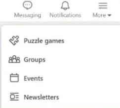
These are relatively small functional changes, but they could make it easier to navigate to the various elements of the app.
LinkedIn said that it will gradually test this new experience with users, with elements varying by region and language. That means users may not be seeing these exact changes as yet.
LinkedIn has also refreshed its icons:
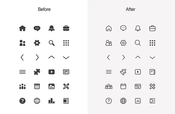
So if you were thinking that LinkedIn looks a little different, you're right, with the refreshed iconography giving the app a new feel.
On another front, LinkedIn is also showing longer clips of text posts in the main feed before users click on the “more” link, which could help creators with engagement.
Though this change could also prompt a reformat of those “broetry” LinkedIn posts that attempted to lure users in by using the cut-off as a means to hide the main text. LinkedIn has mostly gotten rid of those line-by-line posts, but maybe by showing more post text in the feed display, that could provide more incentive to keep people reading.